The days of designing websites for desktop computers first are over. In 2025, mobile-first design isn’t just a trend—it’s a business necessity that directly impacts your search engine rankings, user experience, and conversion rates. If your website still prioritizes desktop users over mobile visitors, you’re potentially losing customers and revenue every single day.
What Is Mobile-First Design?
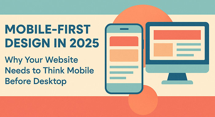
Mobile-first design is a web development and UX design approach where websites are designed and developed for mobile devices first, then progressively enhanced for larger screens like tablets and desktops. This methodology represents a fundamental shift from traditional responsive web design, where desktop layouts were simply adapted to fit smaller screens.
Unlike adaptive design or desktop-first approaches, mobile-first design ensures that your website’s core functionality, content hierarchy, and user interface elements are optimized for smartphones from the ground up. This approach results in faster loading times, better user experience, and improved search engine optimization.
The Mobile Traffic Revolution: Why Mobile-First Matters Now
The statistics are staggering. Mobile devices now account for over 58% of global website traffic, with some industries seeing mobile usage rates exceeding 70%. For e-commerce websites, mobile commerce (m-commerce) represents nearly 43% of all online sales—a figure that continues climbing year over year.
Google’s mobile-first indexing policy, fully implemented since 2021, means that Google primarily uses the mobile version of your website for ranking and indexing. If your website isn’t optimized for mobile users, your search engine rankings will suffer, directly impacting your organic traffic and online visibility.
Local businesses are particularly affected by mobile search behavior. Over 76% of consumers who search for local businesses on their smartphones visit a physical location within 24 hours, making mobile optimization crucial for brick-and-mortar establishments.
Core Principles of Mobile-First Web Design
1. Content Prioritization and Information Architecture
Mobile-first design forces you to identify your most important content and features. With limited screen real estate, every element must serve a purpose. This constraint actually improves your overall website usability by eliminating unnecessary clutter and focusing on user goals.
Effective information architecture for mobile includes:
- Clear navigation menus that work with thumbs, not cursors
- Prominent calls-to-action positioned for easy mobile interaction
- Streamlined content hierarchy that guides users through your conversion funnel
- Touch-friendly interface elements with adequate spacing
2. Performance Optimization for Mobile Networks
Mobile users often browse on slower cellular connections, making website speed optimization critical. Mobile-first design emphasizes lightweight code, optimized images, and efficient loading strategies.
Key performance considerations include:
- Compressed images and modern formats like WebP
- Minified CSS and JavaScript files
- Lazy loading for images and content below the fold
- Content delivery network (CDN) implementation
- Optimized web fonts and minimal external resource dependencies
3. Touch-First User Interface Design
Mobile devices rely on touch interaction, requiring different UX/UI considerations than mouse-based desktop interfaces. Touch-friendly design elements include:
- Minimum 44-pixel tap targets for buttons and links
- Swipe gestures for image galleries and content carousels
- Form fields optimized for mobile keyboards and autofill
- Thumb-zone optimization for frequently used navigation elements
SEO Benefits of Mobile-First Design
Search engine optimization and mobile-first design work hand-in-hand. Google’s algorithm heavily favors websites that provide excellent mobile user experiences, considering factors like:
Core Web Vitals performance on mobile devices, including Largest Contentful Paint (LCP), First Input Delay (FID), and Cumulative Layout Shift (CLS). Websites with poor mobile Core Web Vitals scores experience lower search rankings and reduced organic traffic.
Mobile page speed directly influences both SEO rankings and user behavior. A one-second delay in mobile page load time can reduce conversions by up to 20%. Mobile-first websites typically load 40% faster than desktop-first sites adapted for mobile.
Local SEO optimization benefits significantly from mobile-first design, as local searches are predominantly mobile. Optimized mobile experiences improve local search rankings, Google My Business performance, and “near me” search visibility.
Business Impact: Conversion Rates and Revenue
Mobile-first design directly impacts your bottom line through improved conversion rates and user engagement metrics. Websites with optimized mobile experiences see:
- 67% higher conversion rates compared to non-mobile-optimized sites
- 74% increase in average session duration on mobile devices
- 42% reduction in bounce rates from mobile traffic
- 58% improvement in mobile search rankings within six months
E-commerce businesses particularly benefit from mobile-first approaches. Mobile checkout optimization, including one-click purchasing, mobile payment integration (Apple Pay, Google Pay), and simplified form fields, can increase mobile conversion rates by up to 85%.
Mobile-First Design vs. Responsive Design: Understanding the Difference
While both approaches aim to create websites that work across devices, their methodologies differ significantly:
Responsive web design starts with desktop layouts and uses CSS media queries to adapt content for smaller screens. This often results in compromised mobile experiences with slower loading times and suboptimal user interfaces.
Mobile-first design begins with mobile constraints and progressively enhances the experience for larger screens. This approach typically produces faster, more user-friendly mobile experiences while maintaining excellent desktop functionality.
Adaptive design creates separate mobile and desktop versions, which can be effective but requires maintaining multiple codebases and can create SEO challenges with duplicate content.
Technical Implementation: Development Best Practices
Implementing mobile-first design requires specific technical approaches:
Progressive Enhancement Strategy
Start with core functionality that works on basic mobile devices, then add enhanced features for more capable devices and larger screens. This ensures accessibility across different mobile capabilities and network conditions.
CSS Media Queries for Mobile-First
Use min-width media queries instead of max-width to build from mobile up:
css/* Mobile styles first */
.navigation { display: block; }

/* Tablet enhancement */
@media (min-width: 768px) {
  .navigation { display: flex; }
}

/* Desktop enhancement */
@media (min-width: 1024px) {
  .navigation { justify-content: space-between; }
}
Mobile-First JavaScript
Prioritize essential JavaScript functionality for mobile, avoiding heavy libraries that slow down mobile performance. Implement feature detection rather than device detection for better compatibility.
UX/UI Design Considerations for Mobile-First
User experience design for mobile-first requires understanding mobile user behavior patterns:
Thumb Navigation Zones: Design primary navigation and calls-to-action within comfortable thumb reach areas on smartphone screens.
Micro-Interactions: Implement subtle animations and feedback that feel natural on touch devices without overwhelming slower mobile processors.
Content Chunking: Break content into digestible mobile-friendly sections with clear visual hierarchy and plenty of white space.
Mobile Forms: Optimize form design with appropriate input types, minimal required fields, and mobile-friendly validation patterns.
Industry-Specific Mobile-First Strategies
Different industries require tailored mobile-first approaches:
E-commerce Mobile Design: Focus on product discovery, streamlined checkout processes, and mobile payment integration. Product images must load quickly while maintaining quality, and navigation should facilitate easy browsing and filtering.
Restaurant and Hospitality: Prioritize location information, menu accessibility, reservation systems, and click-to-call functionality. Mobile users often need information quickly while on-the-go.
Professional Services: Emphasize contact forms, service descriptions, and credibility indicators. B2B mobile users often research during commutes or between meetings.
Healthcare: Ensure accessibility compliance, appointment scheduling, and easy access to contact information and directions.
Common Mobile-First Design Mistakes to Avoid
Even well-intentioned mobile-first projects can suffer from implementation mistakes:
Hidden Navigation: Burying important navigation behind hamburger menus without providing clear visual cues about available content and features.
Tiny Text and Touch Targets: Using font sizes below 16px or creating touch targets smaller than 44 pixels, making interaction difficult for users.
Slow Loading Images: Failing to optimize images for mobile bandwidth, resulting in slow page load times and poor user experience.
Desktop-Centric Content: Including lengthy paragraphs or complex layouts that don’t translate well to mobile reading patterns.
Ignoring Landscape Orientation: Failing to optimize for horizontal mobile viewing, which accounts for significant usage during video consumption and gaming.
Tools and Technologies for Mobile-First Development
Modern web development tools support mobile-first methodologies:
CSS Frameworks: Bootstrap, Tailwind CSS, and Foundation offer mobile-first grid systems and components.
Testing Tools: Chrome DevTools device simulation, BrowserStack for real device testing, and Google’s Mobile-Friendly Test for SEO compliance.
Performance Monitoring: Google PageSpeed Insights, GTmetrix, and Core Web Vitals monitoring tools help track mobile performance metrics.
Design Tools: Figma, Sketch, and Adobe XD provide mobile-first design workflows with device-specific artboards and responsive design features.
Future of Mobile-First: Preparing for What’s Next
Mobile technology continues evolving, requiring forward-thinking design approaches:
5G Network Adoption enables richer mobile experiences with faster loading times, creating opportunities for more sophisticated mobile interactions while maintaining the efficiency principles of mobile-first design.
Progressive Web Apps (PWAs) combine mobile-first design with app-like functionality, offering offline capabilities, push notifications, and installation options while maintaining web accessibility.
Voice Search Optimization increasingly influences mobile-first design, as voice queries often happen on mobile devices and require different content optimization strategies.
Augmented Reality Integration on mobile devices creates new design challenges and opportunities, requiring mobile-first thinking for AR experiences.
Getting Started: Your Mobile-First Action Plan
Transitioning to mobile-first design doesn’t require rebuilding your entire website overnight. Here’s a practical implementation approach:
- Audit Your Current Mobile Experience: Use Google’s Mobile-Friendly Test and analyze your mobile traffic patterns, bounce rates, and conversion data.
- Prioritize High-Impact Pages: Start with your homepage, key landing pages, and conversion-critical pages like contact forms and product pages.
- Implement Mobile-First Performance Optimizations: Compress images, minify code, and implement caching strategies to improve mobile loading times.
- Test Extensively on Real Devices: Desktop browser simulation doesn’t capture the full mobile experience. Test on actual smartphones and tablets across different networks.
- Monitor and Iterate: Use analytics tools to track mobile user behavior, conversion rates, and Core Web Vitals scores. Continuously optimize based on real user data.
Conclusion: Mobile-First Is Business-First
Mobile-first design in 2025 isn’t just about following best practices—it’s about meeting your customers where they are and providing experiences that drive business results. With mobile traffic dominating web usage, Google prioritizing mobile-first indexing, and mobile conversion rates continuing to climb, businesses that embrace mobile-first design gain competitive advantages in search rankings, user engagement, and revenue generation.
The question isn’t whether your business needs mobile-first design—it’s how quickly you can implement it. Every day you delay mobile optimization is another day of missed opportunities, lost customers, and reduced search visibility.
Ready to transform your website with mobile-first design? The mobile revolution is here, and your business success depends on being part of it.